 Beat the Monday blues with the Monday Hues! Today's color inspiration comes from fish joyously swimming around in the pond at the La Quinta Civic Center Park.
~ Dio
 Beat the Monday blues with the Monday Hues! Today's color inspiration comes from fish joyously swimming around in the pond at the La Quinta Civic Center Park.


 Happy Monday everyone! Wishing you a delightful week full or color and inspiration, starting off with this delightful palette of buttercream, peach, cocoa, peacock blue and raspberry.
 Beat the Monday Blues with today's Monday Hues featuring a lovely combination of white, teal, mustard and chartreuse. Now if you want these gorgeous vintage set of cups to complete your event decor or inspiration, you can find them on Etsy.
 I've been wanted to host a mother's day tea party for a couple of years now, and for one reason or another I just haven't. I started browsing looking to buy a few sets of vintage tea cups, however right in the middle of my search I came across this "Enchanted" collection. What can I say? The vibrant colors and contrast have me...well, "enchanted". Oh, what would this world be without color? I dare not imagine. On another note, apparently this tea set has a bit of history. It was chosen by Country Living Magazine to help decorate their House of the Year.
 Today's color inspiration comes from a photo by Marite2007 on Flickr. It's a beautiful image of a balcony in Gaios, Paxos Island, Greece. The bright colors and angle of the photo really caught my attention. I think these colors would be great for any spring or summer wedding, baby shower or birthday celebration. ~ Hope today's Monday Hues scared away the Monday Blues. Have a bright and colorful week, full of peace and inspiration.
 Today's Monday Hues were inspired by Dave Richards Photography. This photo was taken while photographing a wedding in Palos Verdes. The angles and shades really caught my attention, but I became even more drawn to it after seeing the results...a gorgeous bride, with a natural glow.
 Visit Dave Richards' blog to view the rest of the pictures for this lovely wedding. ~ Happy Monday!
 Being a Latina, when I hear someone has chosen purple as their wedding color, I immediately get images in my head of all the Quinceañeras I've been to in the past (that's the Latina version of a Sweet 16, celebrated at age 15) where it seemed like the actual color purple exploded upon the world. Some were done in good taste, but others were overdone to the point where everything was purple making the event look too dark, and I'm more of a bright and cheery kind of girl.
 Click on the pictures to view more images of this Frank Sinatra Palm Springs Estate wedding, shot by Christine Arnold.
 Today's color inspiration comes from ara133photography. I enjoy bold feeling and harmony created by combination of warm and cold colors displayed in this image. Even though I only selected a few, there are more colors found within that you can add or substitute, such as gold, silver, mauve, teal, aqua, orange and more. Enjoy, have fun and be inspired!
 Today's color palette was inspired by HoneyTree's fine art photography. These warm summer tones are very feminine and ideal for a summer event for a bride or birthday girl who loves all shades of pink.
 A while back I had started posted a series of color inspiration posts. Then the deadlines started pouring-in and blogging was put on the back burner for a while. Today, I'd like to bring back my color inspirations posts with a title, from now on to be know as the "Monday Hues". Some people have the Monday Blues, but not here baby, we've got the Monday Hues. So, on Monday mornings when you're having a hard time adjusting to being back at the office, or you just need a little inspiration to get you motivated, come on over to my blog for a little color pick-me-up.
 Found this beautiful image via Anna Maria Horner blog. I instantly fell in love with the colors which lead to me create this week's color inspiration palette. The Palette consists of a deep shade of Cranberry, Hot Pink (Fusia), Silver and only hints of moss to add a nature feel. Last but not least, lots of White to make the colors pop.
 This week's color inspiration comes from a photo image by Life Love Paper (found via Simply Hue). I typically don't think of pink as a holiday color, but after being awed by such beautiful blend of complimentary colors which lifted my holiday spirit, I found myself inspired and eager to share.
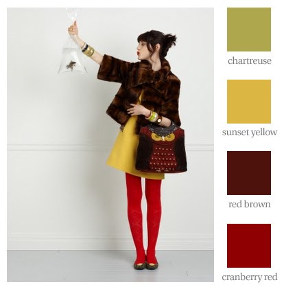 In browsing my favorite blogs, I came across this photo at My Favorite Things. Just like Molly, I too really, really want this purse - I love owls! I also liked the color composition of this photo which inspired me to create a this color palette to share with you today. Happy Colorful Monday!
 Color Inspiration # 1: Eggshell, Cement, Sage and Dusty Rose